
BASIC COLOR HARMONY PRINCIPLES YOU SHOULD KNOW
Color is a crucial element that influences emotions and user experiences. Understanding basic color harmony principles will help you “paint” a harmonious, impressive living space that reflects your personal style. Let’s explore this topic further with URHOUSE in the article below!
Effective color harmony principles in interior design
The 60 – 30 – 10 rule
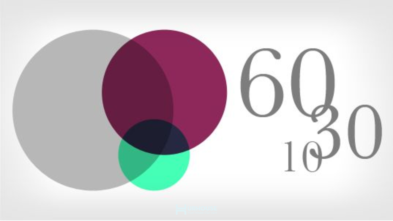
What is the 60-30-10 color rule?
The 60-30-10 rule is a fundamental color principle in design. Each number in this rule represents the proportion of colors chosen for a space. Specifically:
- 60% represents the dominant color of the overall space. In interior design and construction, this primary color is mainly applied to large surfaces such as walls, ceilings, and partitions. Soft, muted tones are often preferred as they create a sense of comfort and openness. Especially in countries with a hot and humid climate like Vietnam, the dominant color should help minimize the feeling of heat and discomfort.
- 30% represents the secondary color: It supports and enhances the dominant color, adding harmony and depth to the space.
- 10% represents the accent color: This color adds emphasis, personalization, and highlights key details within the space.
The 60-30-10 color rule ensures balance and harmony among colors within a space while also creating a cohesive connection between interior design elements, resulting in an engaging and aesthetically pleasing environment.
Monochromatic Color Scheme
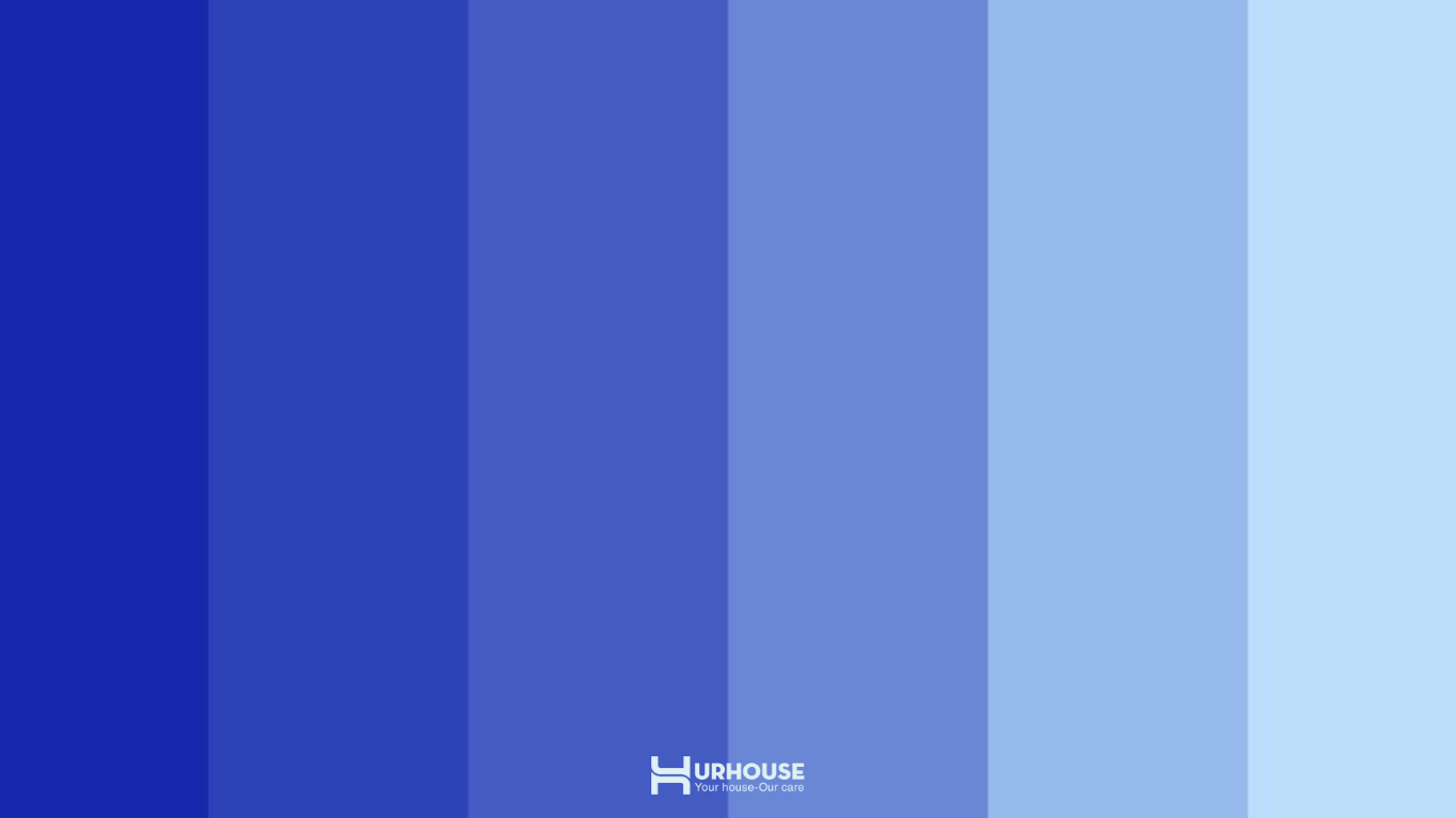
The monochromatic color scheme principle primarily uses a single dominant color
Simply put, the monochromatic color scheme involves using a single dominant color or various shades and tones of the same color to create a sense of harmony and resonance. Variations from light to dark, from bright to muted, all contribute to enhancing the beauty of the main color, resulting in a refined and elegant ambiance. This color scheme is often used in minimalist designs. While it may seem simple, its very simplicity allows for a greater focus on other design elements and content. A unified color palette creates a harmonious space, enabling other details to stand out naturally and draw attention in a subtle yet captivating way.
Analogous Color Scheme
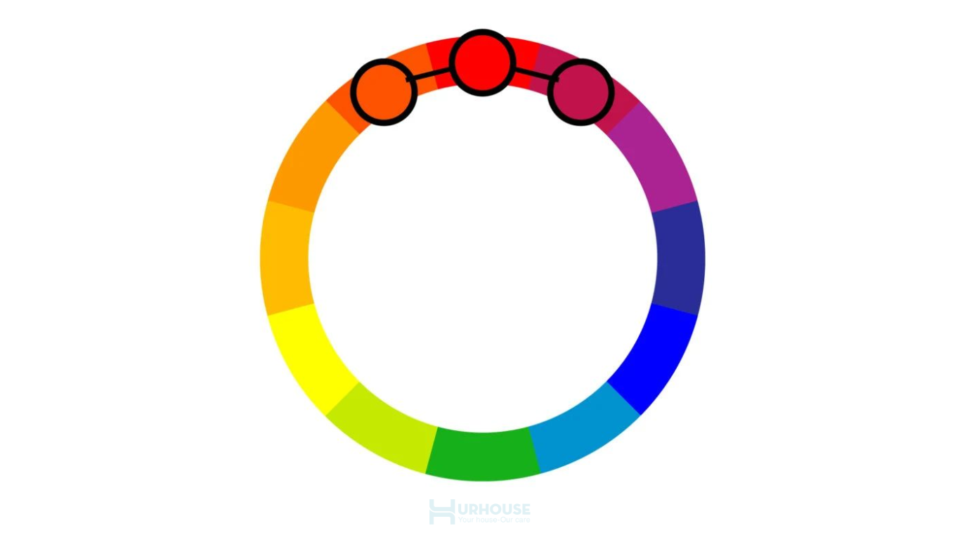
The analogous color scheme involves combining colors that are adjacent to each other on the color wheel, creating harmonious and refined color gradients. Compared to the monochromatic color scheme, this method offers a richer and more vibrant visual experience.
With this principle, you need to choose a dominant color, which will be used the most. The second color is used to highlight important details, while the third color is reserved for secondary elements.
Complementary Color Scheme
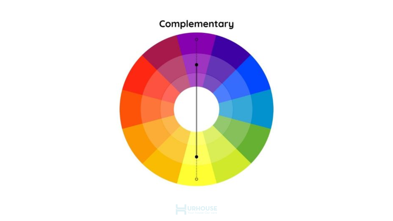
Applying contrasting color, purple and yellow, in the complementary color scheme
The complementary color scheme involves using two colors that are opposite each other on the color wheel, such as blue and orange, red and green, or purple and yellow. This color combination is created through the contrast between hues, producing a striking visual effect. It effectively highlights shapes, lines, and edges, enhancing the clarity of the architect’s creative vision in the design.
Split Complementary Color Scheme
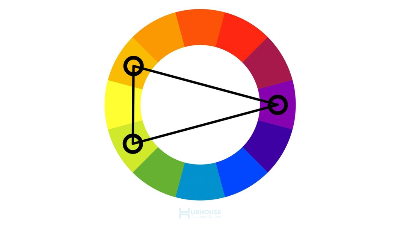
The split-complementary color scheme involves pairing a dominant color with two contrasting colors. Compared to the complementary color scheme, this method offers a softer contrast while providing greater flexibility in using a variety of colors. It creates a rich and harmonious space without compromising balance.
Triadic Complementary
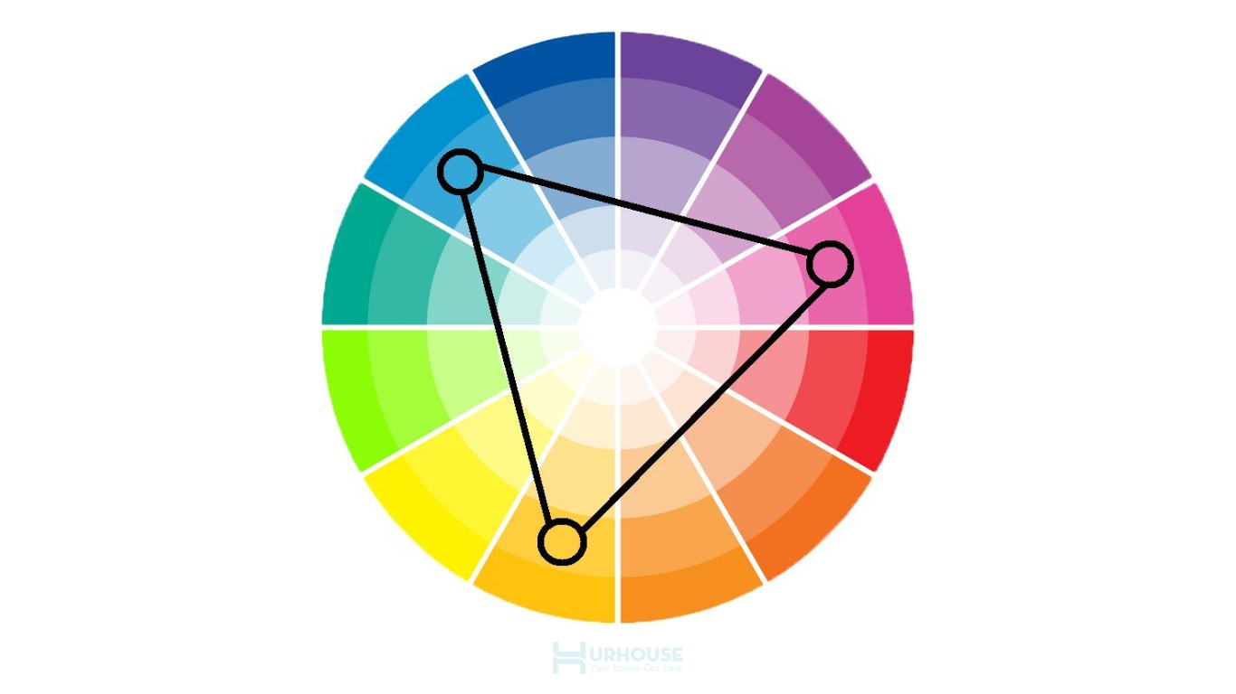
Triadic Complementary iss considered the safest color scheme.
This is considered the safest color scheme among all common color-matching methods. In this principle, you only need to use three colors on the color wheel to form an equilateral triangle.
Tetradic Complementary
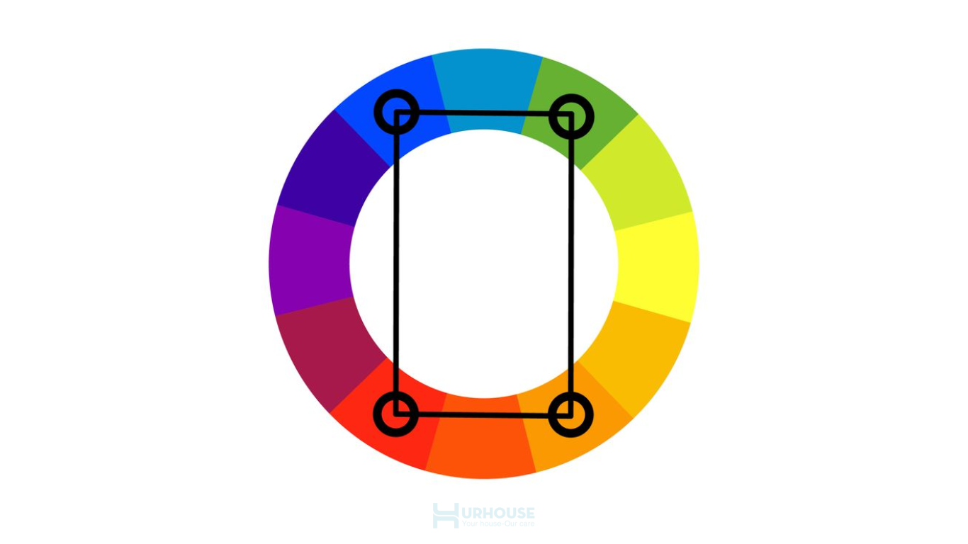
Tetradic Complementary is considered the most complex color-matching principle
The tetradic complementary color scheme is often applied by experienced designers due to its complexity in balancing colors within a space. This principle is formed by combining two pairs of warm and cool colors to create a harmonious overall composition. It is ideal for those who wish to design a truly unique and highly personalized interior space.
URHOUSE – A reputable and high-quality interior design and construction firm
With the mission of creating living spaces that balance aesthetics and functionality, the URHOUSE team constantly seeks and applies the latest design trends while combining meticulous craftsmanship in construction. This ensures that each living space is not only visually appealing but also highly practical.
We understand that every project carries its own unique story. At URHOUSE, we always listen, empathize, and translate those values into every design detail. Our dedication, professionalism, and commitment to quality set us apart, turning each project into an inspiring journey of creation filled with emotion.
Conclusion
Mastering the basic color harmony principles is the first step to owning your living space, transforming ideas into designs rich in emotion and depth. Each color scheme brings a unique beauty to every room, conveying personal stories and individuality. Start applying these principles today to create a living space that is both distinctive and full of life.
